Home » Tutorial
Category Archives: Tutorial
Customers Are Awesome, So Design for Them!
The real purpose of an art, comic, music, or blog website is to give a reader information about you in under 7 seconds that tells them why they should stay and keep reading you from now on.
There it is – the Meaning of Life. The Lost Scroll. The Fate of Atlantis. Master this and you have Real Ultimate Power.

Art and design is largely about “image”. While this is true, many artists fall prey to Too Much Image when it comes to designing their website. I believe that a website should be the frame for your brilliance. It shouldn’t eclipse your work. It also shouldn’t take excessive time to load or otherwise alter the user’s browsing experience. Today, I am going to talk about some guidelines for making the best impact with your website.
1. Avoid Flash: I personally don’t like Flash unless it is specifically for a flash cartoon or game that you have made. I have never sat through a Flash intro to a website and said afterward, “Gee, I really liked sitting there waiting to get to this website I have never heard of before.” Never. Most people will not wait.
Flash also doesn’t display on an iPhone and most other mobile devices, so if you must use Flash, make sure there is a non-Flash option.
You might say, “What idiot only uses an iPhone to browse the internet?” Well, that idiot would be me. I work hours that would make a large man (or even David Hasselhoff) cry. I rarely am able to get to my own desktop computer. A Flash only website is enough to prevent me from seeing it entirely. I do not have time to “surf the net” in the few hours I have at home each day. Also, I am not alone. Our culture is going mobile in a big way.
2. Don’t have music that auto-plays: There had been some debate about this in the case of bands. Some bands insist that the best way to get their work to their customer is to have their music auto play. I disagree. It is important to quickly get your work to that person’s ears, but politeness toward your customer always supersedes any sales tactic.
Always.
These bands aren’t considering people who are browsing at work or school. Just looking at my personal web traffic, I see that most of my readers come right when they get to work or school. I think the entire internet would be empty if you removed this type of traffic. At worst, that MP3 file is an embarrassment to the person who hasn’t had time to adjust the volume on their speakers to prevent the whole planet from hearing it. At best, it’s annoying to the person who was already listening to iTunes.
Both of these scenarios happened to me. Both of them resulted in my immediately closing my browser and never coming back.
3. Don’t change the user’s browsing atmosphere: Changing the end user’s browsing atmosphere is similarly rude and jarring. Things like changing their cursor to a cross hair or forcing you to view their website full screen so that you can’t see your OS’s navigation menus are just plain inadvisable. Most people react with fear to new things. This is no exception.
4. Take different browsing scenarios into account: Will your website run on a computer that has a 800X600 resolution and a dial-up modem? How about on both Mac and PC browsers? Does it display on an iPhone, Palm OS, and on Windows Mobile?
As I said before, the range of ways someone could be browsing the internet is wider than ever before. While you can’t test for every single device or browser, do at least some testing to make sure things aren’t totally blown looking on something, especially if the something is very popular (even if you don’t like/use it personally).
5. When in doubt, don’t do it: If a feature doesn’t speed up the delivery of your work to the person loading the website – it should not be used. Trust me, if your work isn’t good, no amount of “cool” features are going to get you a sale. When in doubt, don’t add the feature. Focus on content first, then add whiz bang stuff later.
So there you have it – some basic guidelines about how to design for your customers so that you can optimize those valuable first 7 seconds and keep a new visitor for life.
Like all guidelines, there may be some special case where some of them can be broken. Have you used any of these features (or others) and made them work for you? Or, have you see a hideous offender of poor web design that sends customers running? Let me know in the comments!
The Creative Comfort Zone
The success of free sites like Deviant Art shows how many artists don’t want to be bothered with making their own site. Sure, some of them do have their own site in addition to Deviant Art, but most don’t and many of the ones that do rarely update their own sites.
I am not saying that Deviant Art “sucks”. Deviant Art is awesome. For no investment, anyone of any skill level can experiment with online publishing. This is a great way for someone new to the field to figure out if this is something that they would like to do. Probably every artist should have some sort of presence there – just like MySpace and Facebook – simply because you can. More exposure is always better.
However, Deviant Art should NOT be your main website.
I say this because:
1. Their interface is quite confusing for the end user. You cannot customize it to make your work easier to view by someone who is not familiar with the Deviant Art culture. The first 20 times someone linked me to their Deviant Art page I left without seeing their art because I couldn’t figure out where the gallery was. It can be very annoying.
2. When Deviant Art is down…it’s down. You can’t fix it. If your work is unavailable for weeks you have no recourse because you don’t control it.
3. Your URL is YourName.deviantart.com. This might be good for networking with others on the site, but it is not so professional for people who aren’t.
4. Passive ad revenue is one of the the largest and easiest source of income – and you can’t do that on Deviant Art. You actually are making them rich – not yourself. Of course since the cost to host your stuff is free, it’s a balance–but still, eventually you’ll want to make money (I assume) off your work.
You might say, “Hey, Oni! I get a lot of people buying commissions from me on Deviant Art. Why do I need ad revenue?”
There are two ways of thinking about it:
1. Working yourself to carpal tunnel cranking out as many commissions as you can for a small amount of dollars. Generally you will probably find that this leaves you too busy to augment your brand. Oompa loompa doopity doo…
2. Do commissions for x amount of dollars when you feel like it and collect far more than x dollars for doing nothing but getting people looking at your work. Have tine to build your brand and a social life.
For my purposes, I choose 2.
If jumping right into working with something like WordPress is daunting, a good thing to do is to at least buy your own URL/domain name that redirects to your Deviant Art. This way, when you finally take the plunge you won’t lose your hard-earned fans out of confusion. They’ll go to where you direct them.
I am a big advocate of controlling where and how my work is presented on the web because it is just that important. Nobody else cares if your work is represented well. You need to care.
They say that you should dress for the job you want, not the job you have. This is very true. It is also very true for how you “dress” your work.
I urge you to try out free sites like Deviant Art and to even maintain a presence there. Just remember that the end game is about making money for you by developing a healthy career. If you hope to achieve that, you need to take control of your work. Too many artists are concerned about the immediate future and don’t invest in a holistic approach to career development that will give them strength 30 years from now. A balance needs to be understood if one hopes to thrive.
“Hidden” AWSOM Plugin Features: Creating default cache and gallery folders
The AWSOM Pixgallery image gallery plugin for WordPress is designed to be an easy way for users to get a gallery of their images loaded into their site with a minimum of work and time. One of it’s “hidden” features is the ability to go in and create default folders on your web server to hold both your thumbnail images and an initial gallery folder to hold your images. When Pixgallery is first activated it will attempt to create these folders in your WordPress uploads folder (this is the same folder that holds your images that get uploaded through the image upload function when writing posts or pages). In some cases this may not work, usually due to a permissions issue on your uploads folder or wp-content folder that prevents new files/folders from being written.
In these cases Pixgallery will detect that the folder wasn’t written and present you with options to create the folders later. On the settings/options page for Pixgallery you’ll see a link at the bottom of the page to create and switch to the default cache folder. If the folder was originally created properly there will be a statement there saying that the cache folder was already created.
On the Manage Pixgallery Galleries page you’ll see a button at the top of the page that says Create Default Gallery Folder. If this folder was created properly during plugin activation there will be a statement that the default gallery has already been created and will list the gallery path.
This ability is just one of the small hidden ways that Pixgallery has been designed to make your life as website admin easier.
How To Change the Language Used in a WordPress Plugin
This is a brief tutorial on how to update your AWSOM News Announcement database table to display any language type you’d like. It’s actually pretty straight forward. It’s best if you do not have any news posts saved since changing the language type might make them display incorrectly.
First thing you need to do is go to your web server and go to your MySQL administration tool. Typically this is a program called PhpMyAdmin (which I’ll be using to demonstrate–but any program will work as long as you can access the same areas I’ll be showing).
Start by selecting your WordPress database. This is the database you input into the wp-config.php file when you originally set up WordPress. You can select from your current databases by using the drop down menu on the left side:
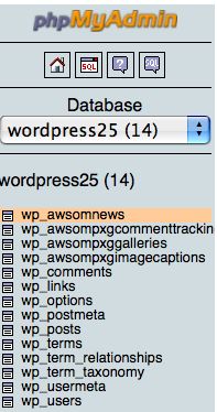
Once you’ve selected the correct database you need to go to the AWSOM News Announcement table that’s in the database. It is named awsomnews but has a header prefix that’s typically wp_, but could be a custom one that you added to the wp-config.php file. click it’s name in the list under your database name on the left and it should open a new page in the main area showing details of that table.
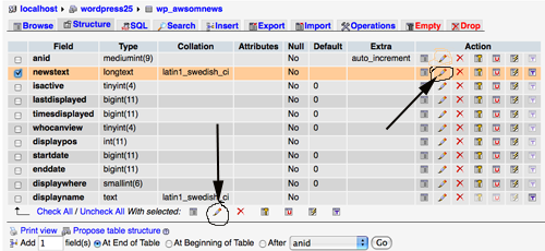
Notice that there is a column called “collation” and it lists “latin1_swedish_ci”–this is the default language type that MySQL uses unless specifically told to use a different language type (MySQL is originally a swedish product). This language type does not display Asian or other non-English lettering based languages well (and honestly has issues with regular English also). What we need to do is change this to the correct language for you.
You can do one of 2 things at this point. You can mark the checkbox next to “newstext” and click the bottom pencil icon or more simply click the pencil icon in the same row. This will open up the individual field for editing.
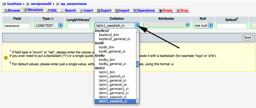
Now, the difficult part. In the collation drop down select the language type you’d like. Yes, there are a very large number of them and it’s not always easy to know which one to use. For regular English “utf8-bin” is good. You’ll need to look this up for your own language since I have no idea what’s good for any other specific language. Once you know which one you want make sure it’s selected in the drop down box. Then click the “save” button.
That’s basically it. Go and try it out.
“Hidden” AWSOM Plugin features: Display Ads to Non-Registered Users
As part of my “Hidden” features of AWSOM Plugins I want to point out a usage for the AWSOM News Announcement plugin for WordPress that may be of use to Site Admins. Most people who use the AWSOM News Announcement plugin typically use it for it’s most basic function: adding a News block above your posts on the Index page of your site. This is one great usage of this plugin and the most obvious one. But you can have multiple News Posts active at the same time, so I’d like to point out another easy usage that adds power and capabilities to your site.
One of the things that you can select when adding a new news announcement is what viewer level is able to see that particular News Post, and each News Post can have different viewer levels. By default it’s set to “everyone”, but you are able to restrict the viewer to any of the regular WordPress registered user levels. So, you can make a News Post only visible to Subscribers or Administrators, or any level in between. This makes the News Post a handy way of informing other members of your site about important information that only applies to them.
Of course an obvious usage is to restrict certain things so that only registered visitors can see/use things. An example is an audio/video player for extra site content. With the “run php” setting in News Announcement turned on you can embed any player that requires javascript or php code to function. Now you have created an incentive for visitors to sign up to your site.
Conversely you can do things so that ONLY non-subscribers see certain News Posts. By selecting this as the viewer level for a post, it only gets shown to general visitors–>which makes it an excellent way of displaying ads to non-registered users while making it a “benefit” for people to sign up to your blog so that they aren’t presented with ads. Since any content can be added to a News Post and can run, almost any ad company code or system can be set to display in a News Post.
So not only do you now have a way to give your readers information, but you can present ads and reserve enhanced content and generate more reasons for visitors to interact with your blog.